Canals of Amsterdam
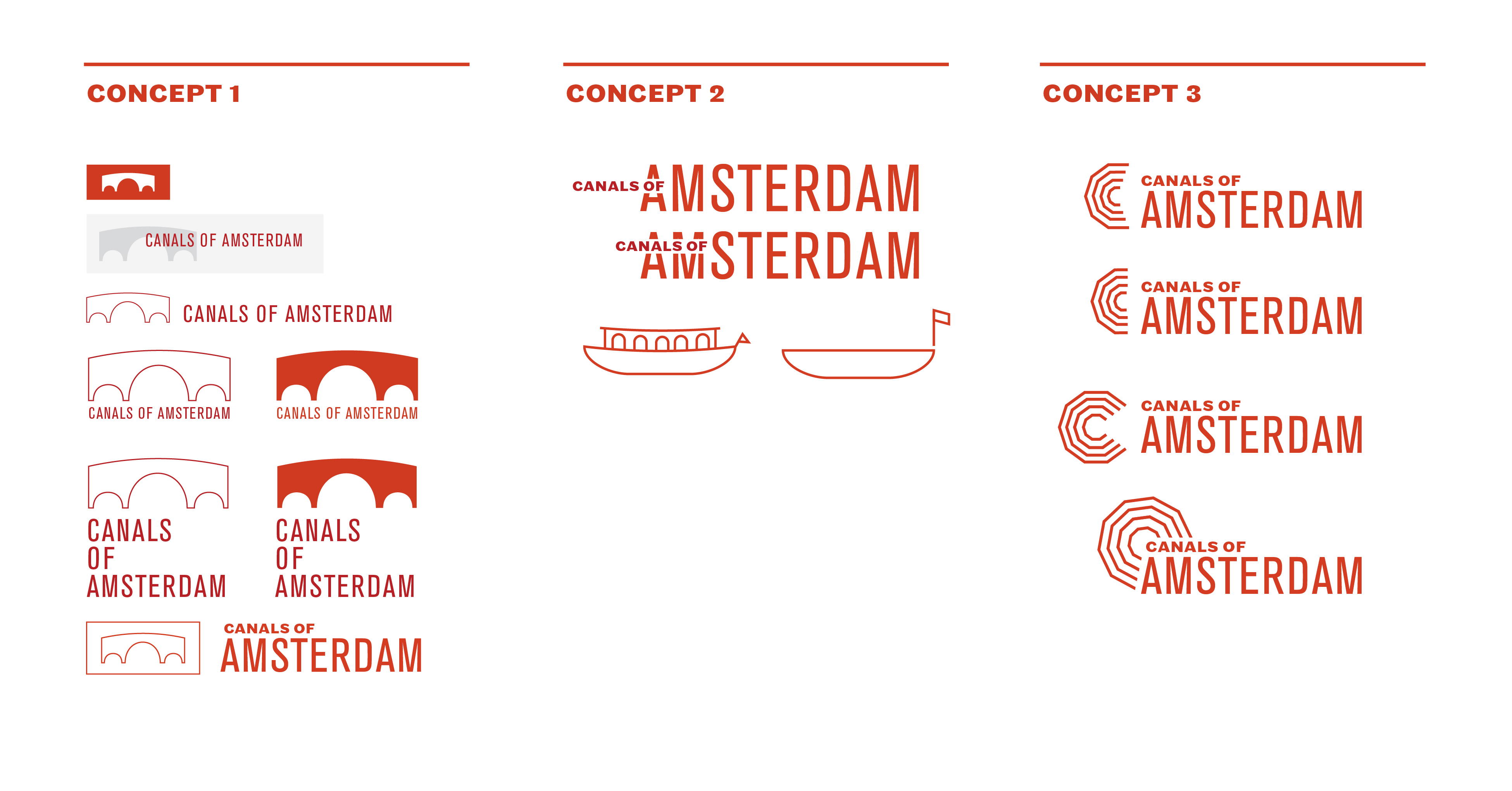
This project was created for Doug Scott's Graphic Design Synthesis course, during the Spring of 2018. The class is structured with the goal of designing a comprehensive identity & brand system for the UNESCO World Heratige Site of your choosing. After some initial research, sketching, and moodboarding, I settled on the Canals of Amsterdam, and got to work drafting logos, color palettes and typefaces.

BRANDING CHOICES
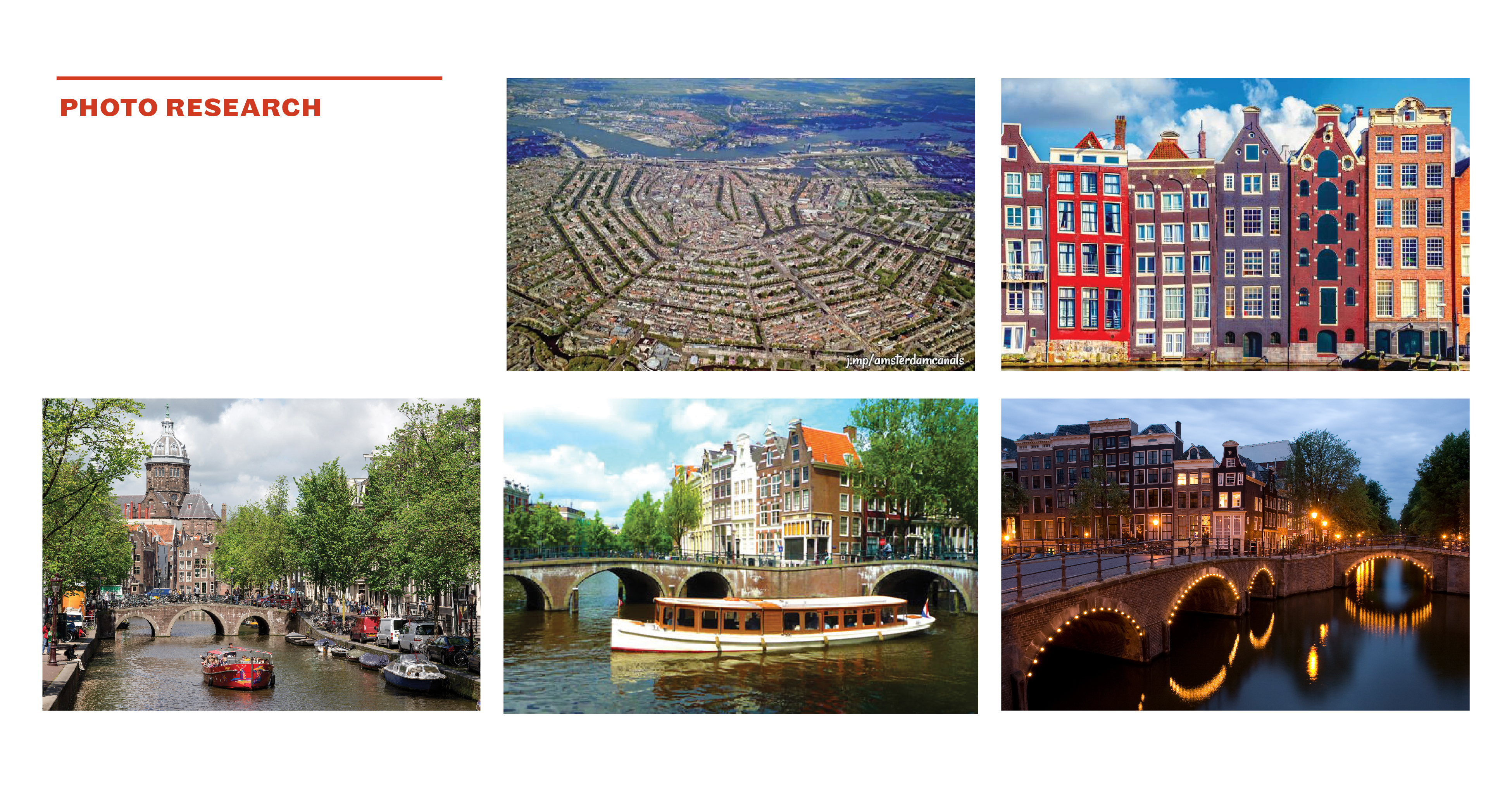
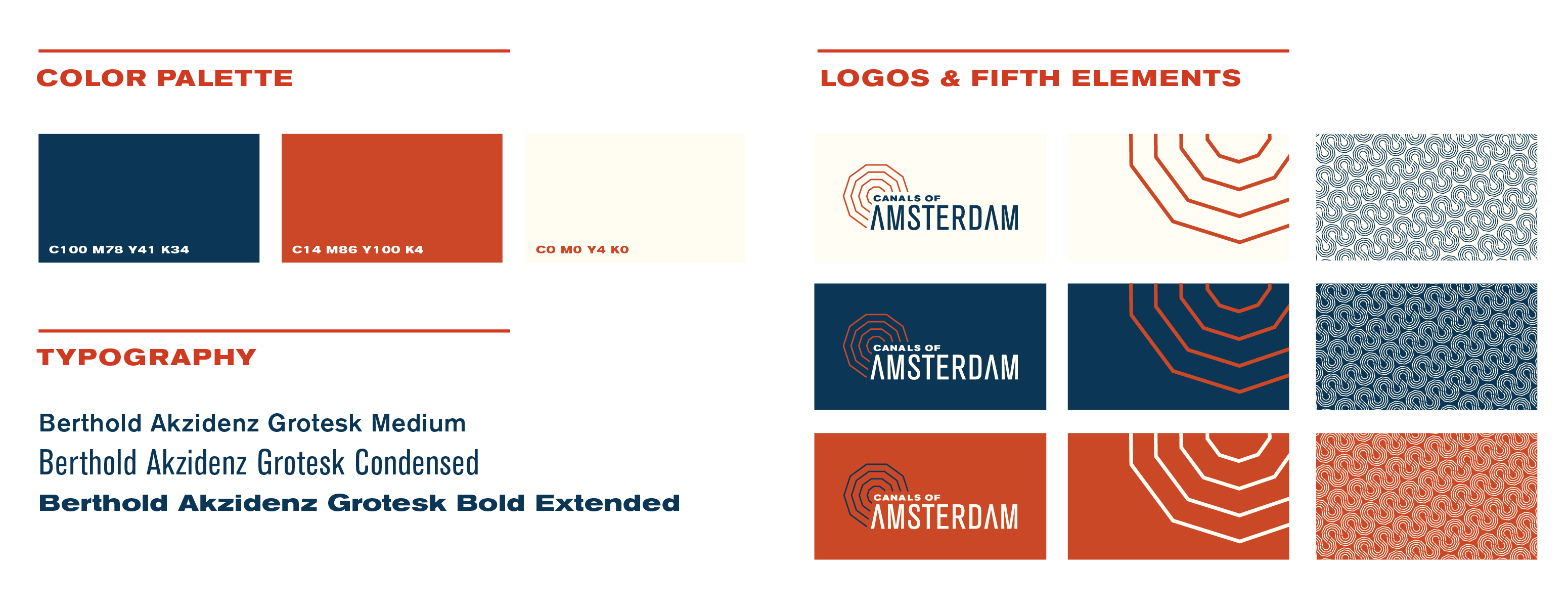
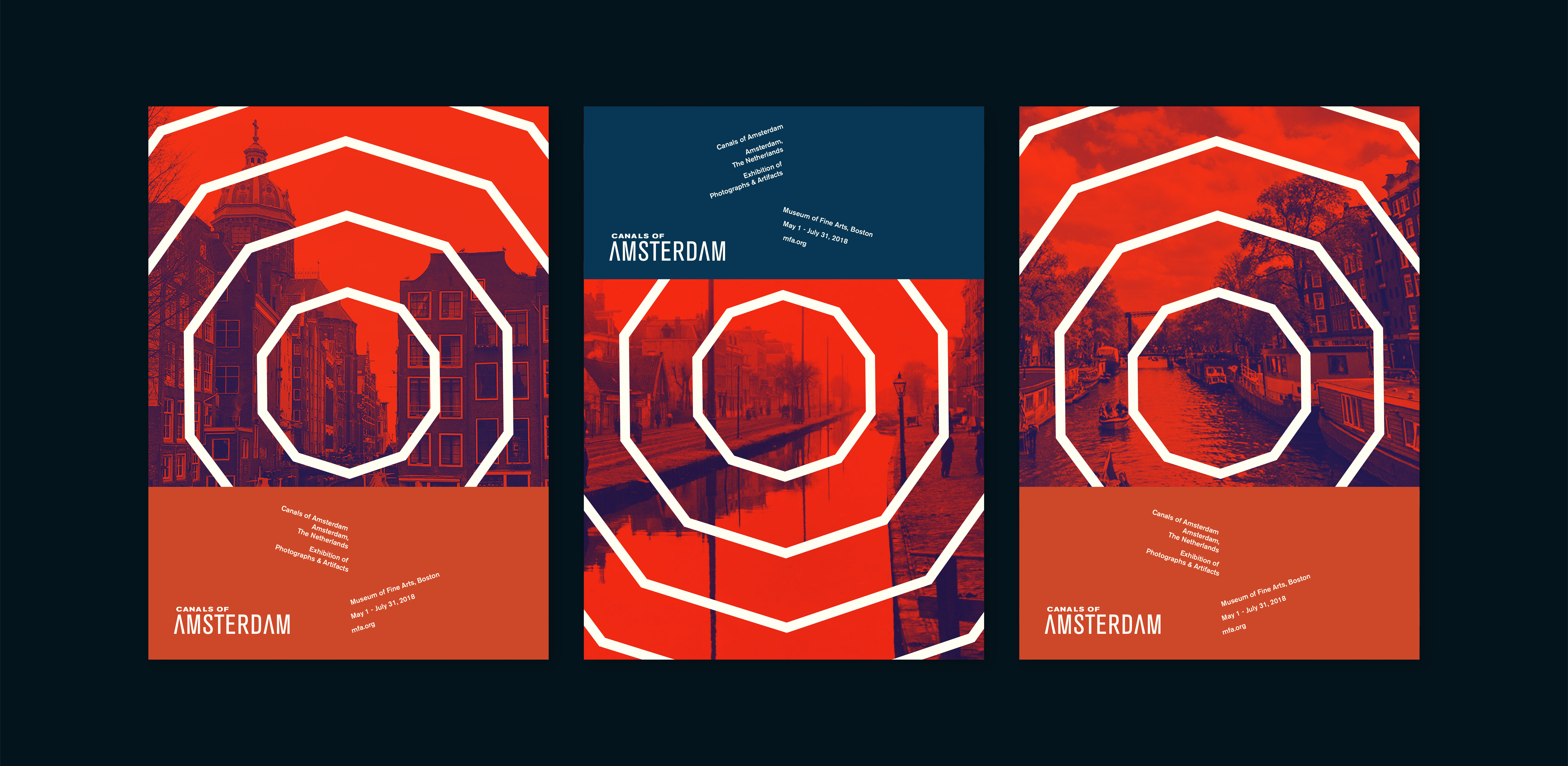
I started by looking at images for visual inspiration, and then drafting logos. I settled on an abstracted mark inspired by the overhead view of the concentric canals combined with a logotype, which I then expanded outwards into a larger design element, and a repeating pattern which is utilized in various applications. The city of Amsterdam is incredibly colorful, but also historic and I wanted to reflect that by using a bold and contrasting color palette.
FINAL COLLATERAL
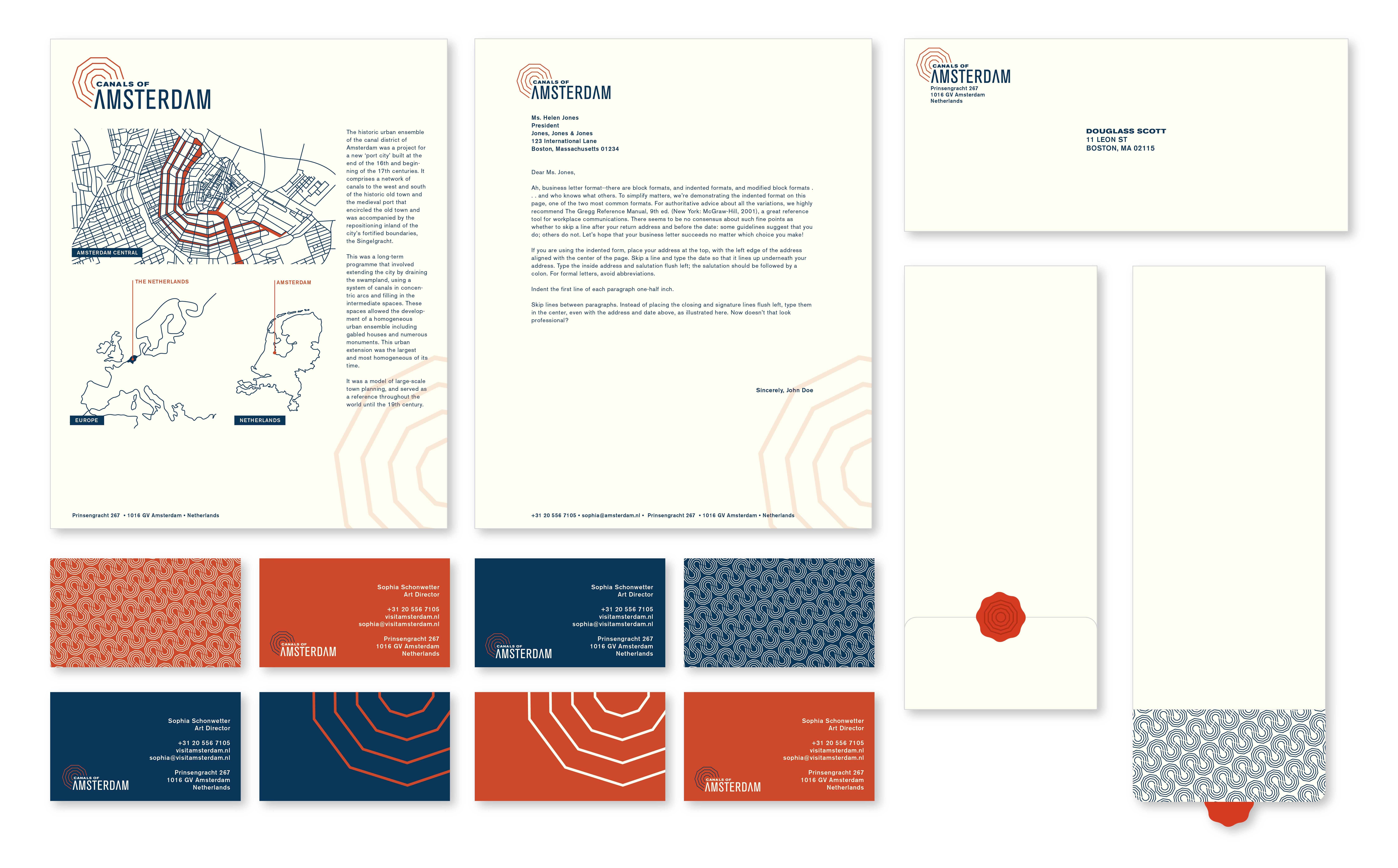
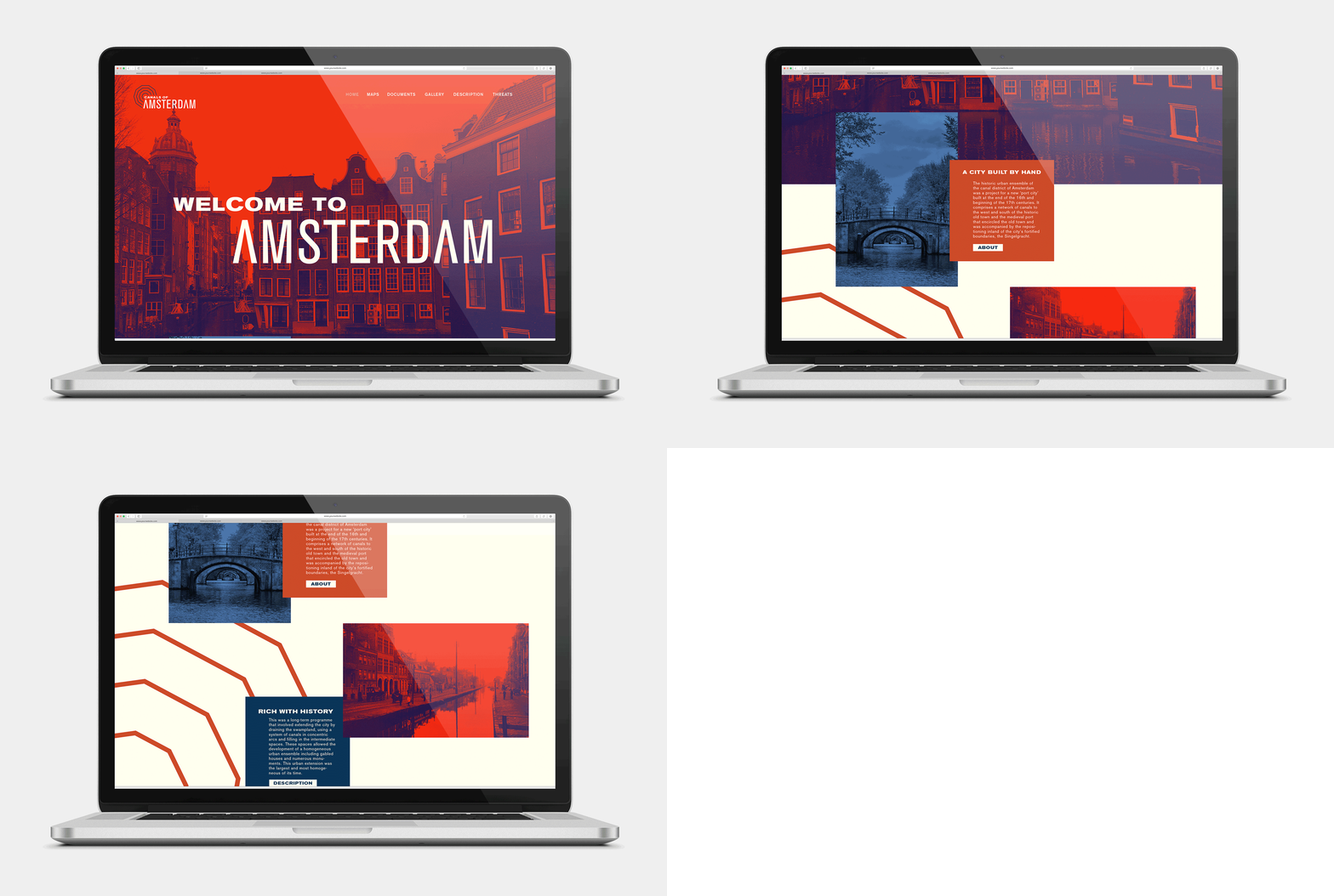
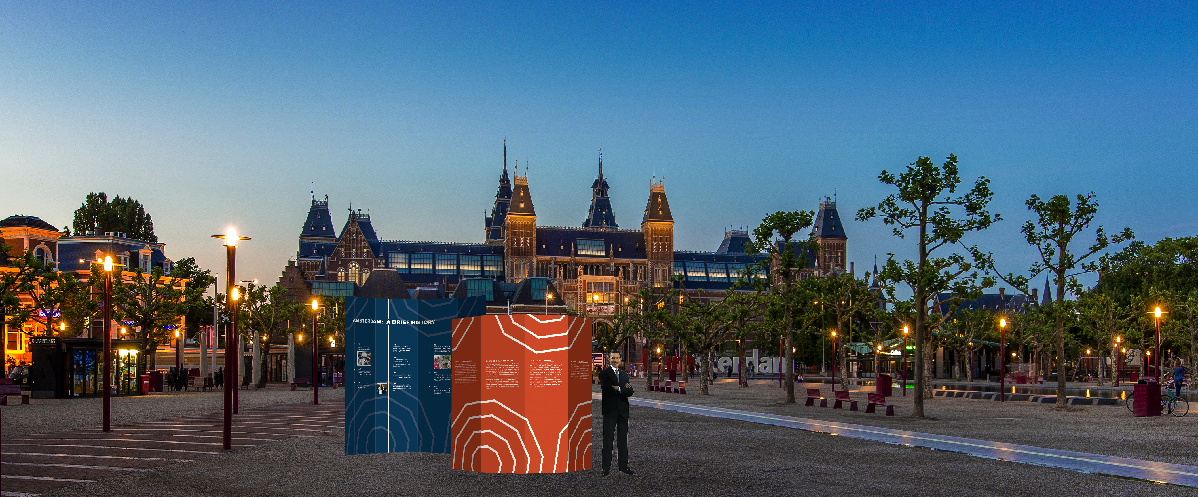
We were instructed to come up with a specific set of collateral pieces, beginning with simpler print pieces, and expanding outward into three-dimensional site signs, a landing page, and informational booklets. The final body of work included:
- Business Cards
- Letterhead + Envelope
- Informational sheet
- App Button
- Series of ads for The New Yorker
- Website Landing Page
- Three-Dimensional, Multi-Lingual Site Sign
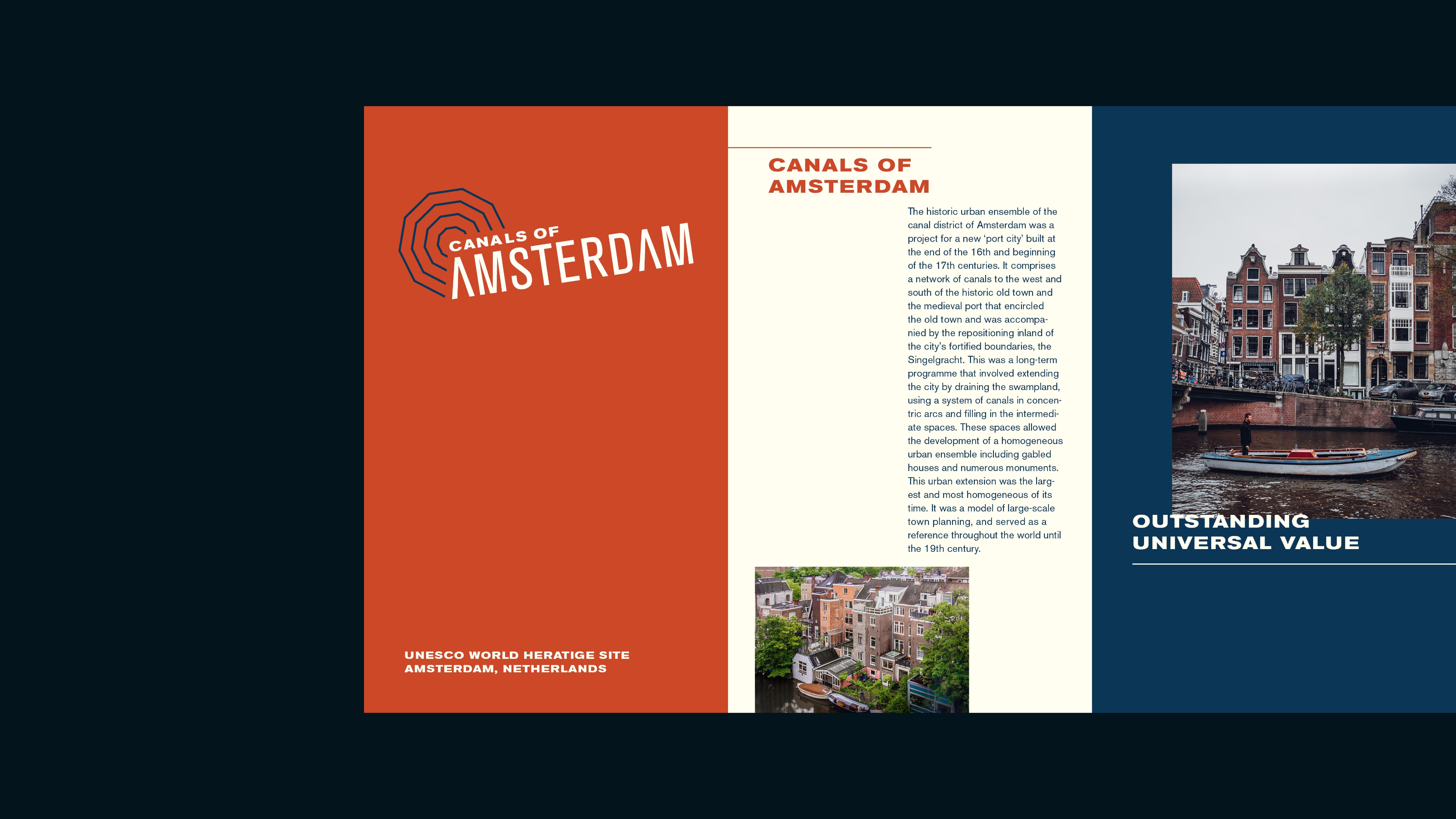
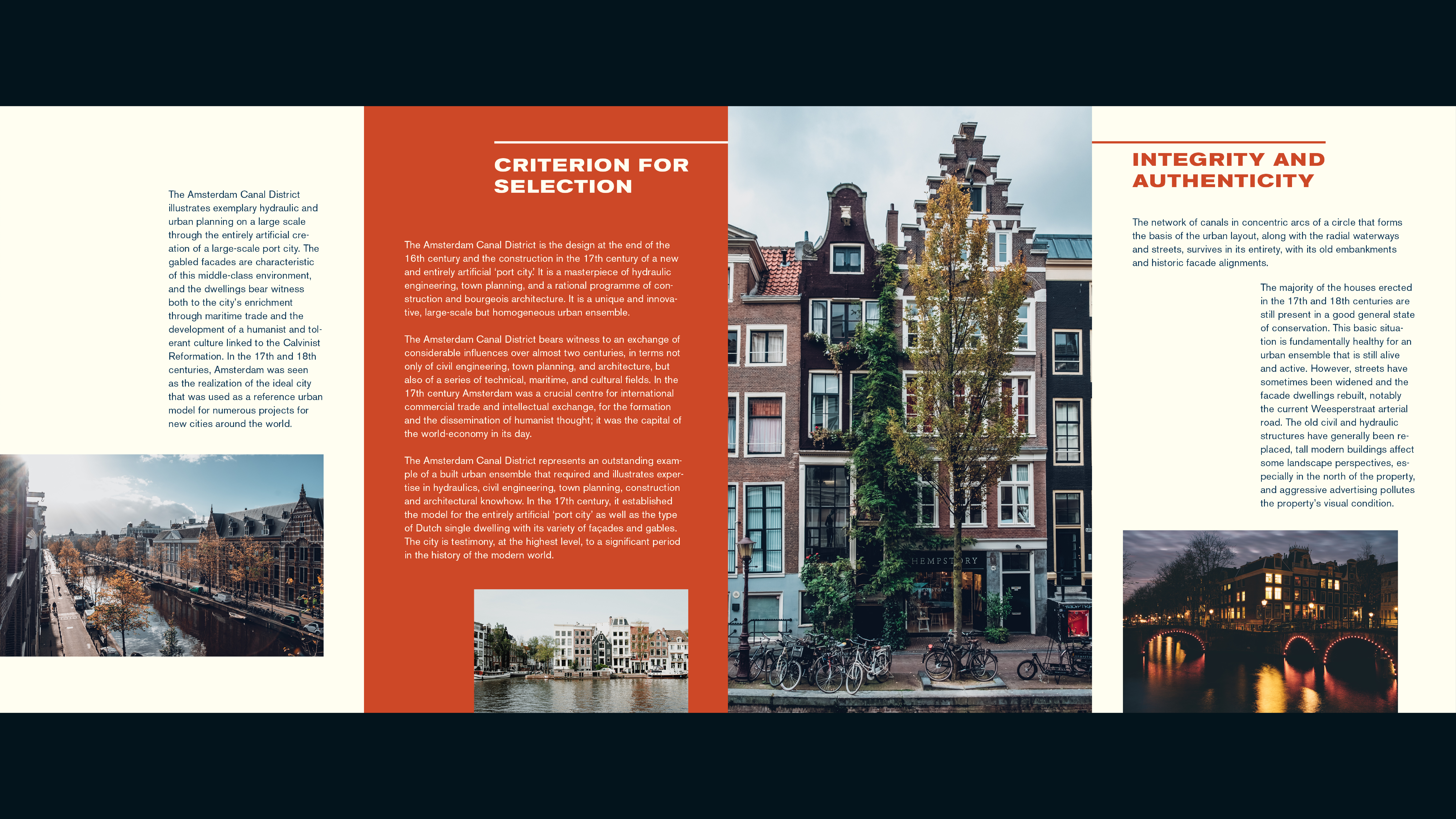
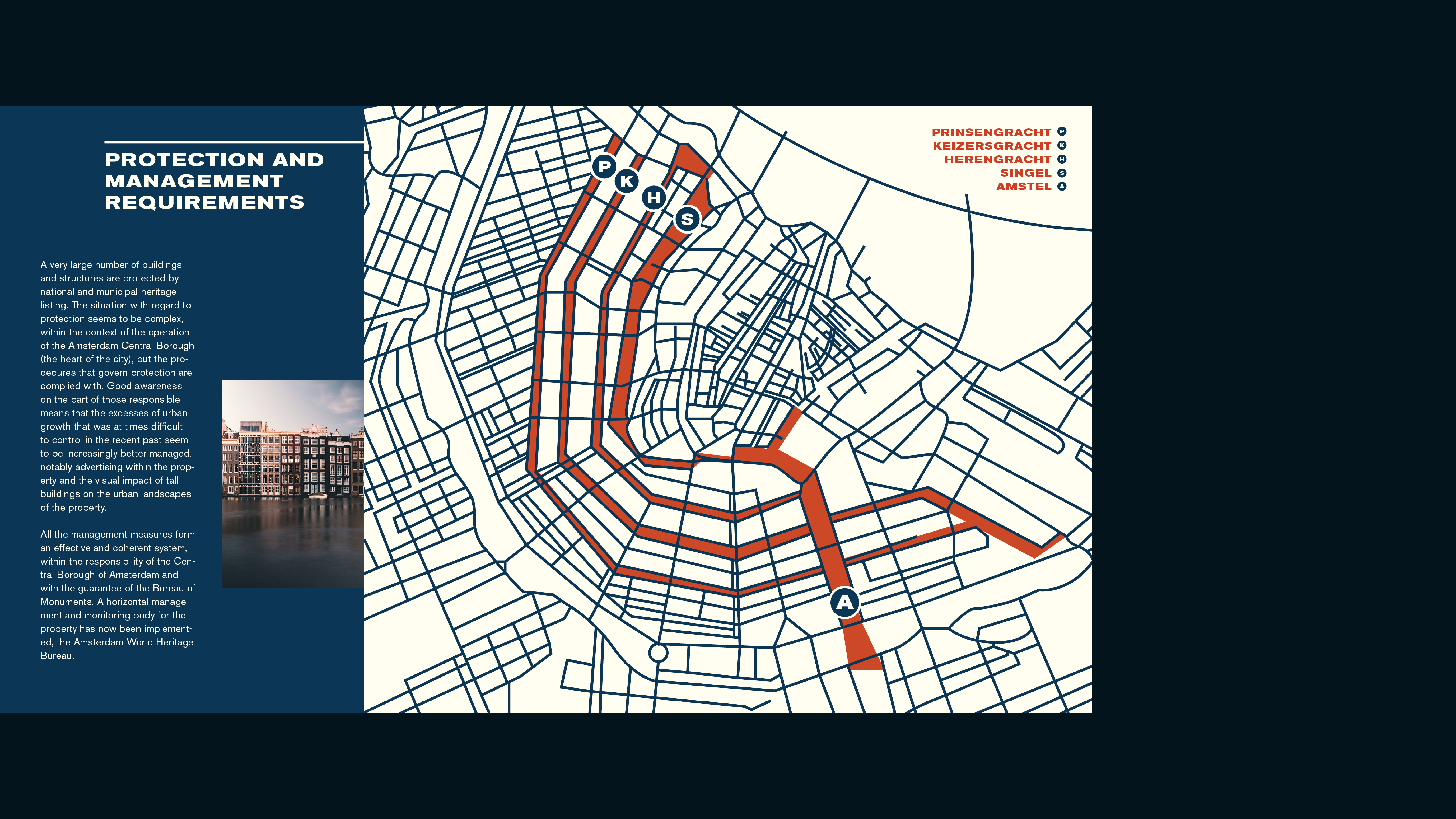
- Site-Specific Informational Booklet
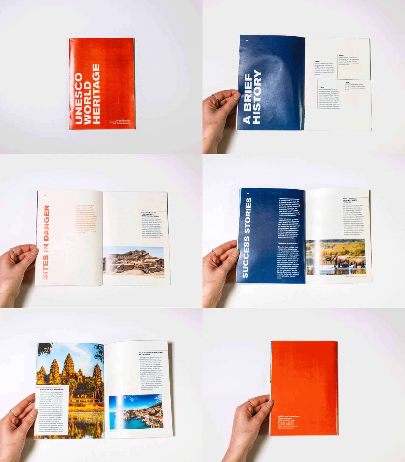
- UNESCO History Informational Booklet

BOOKLETS
In addition to the above materials, we were also asked to create two booklets - one specifically for our site, and one detailing the history of UNESCO's World Heratige Sites. The larger booklet about the history of UNESCO features a pocket (in the shape of the mark in the logo), that stores the smaller 10-page accordion booklet about the Canals of Amsterdam. Below is a closer look at both booklets.
