Let's Visit: City Guides
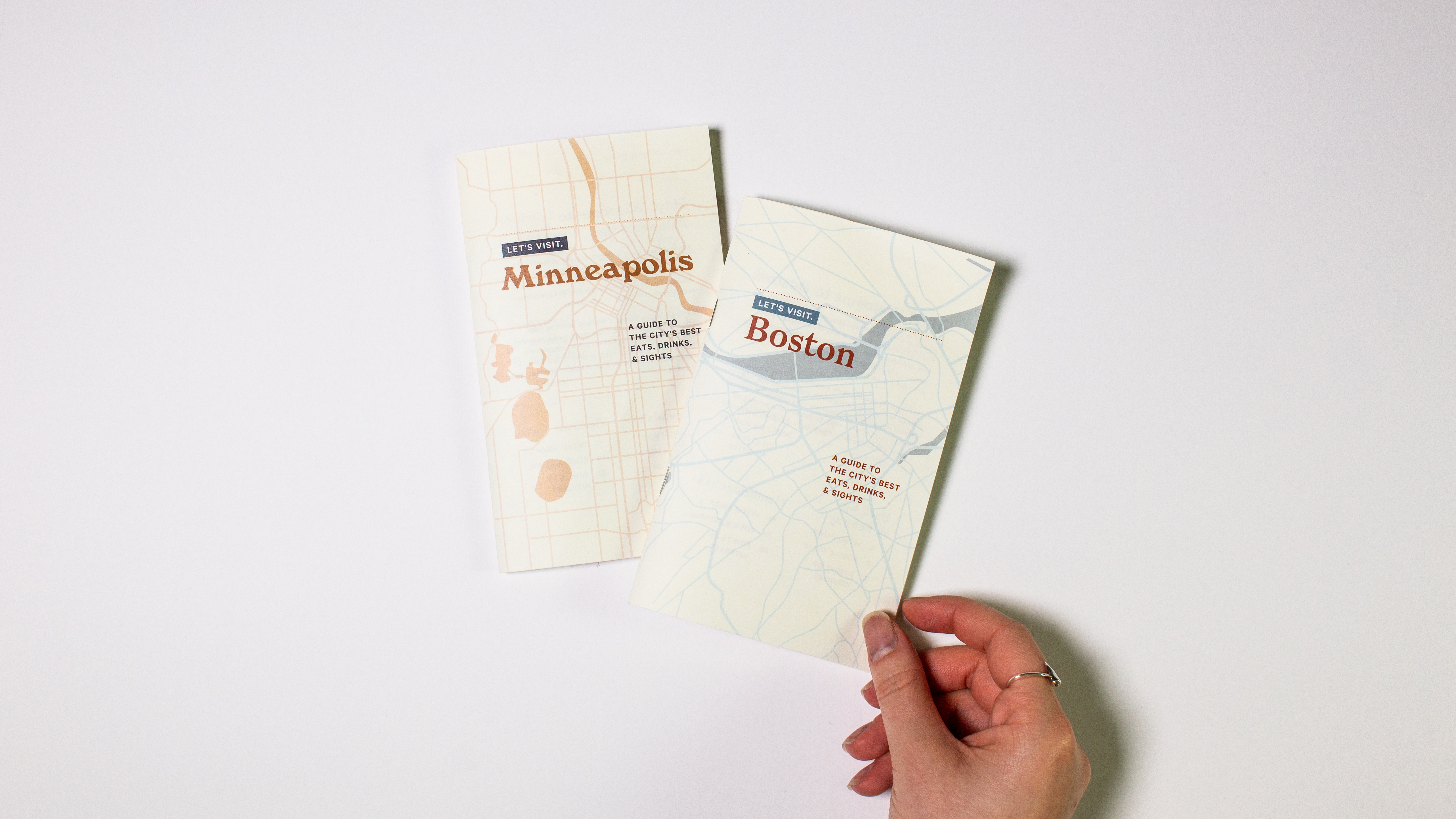
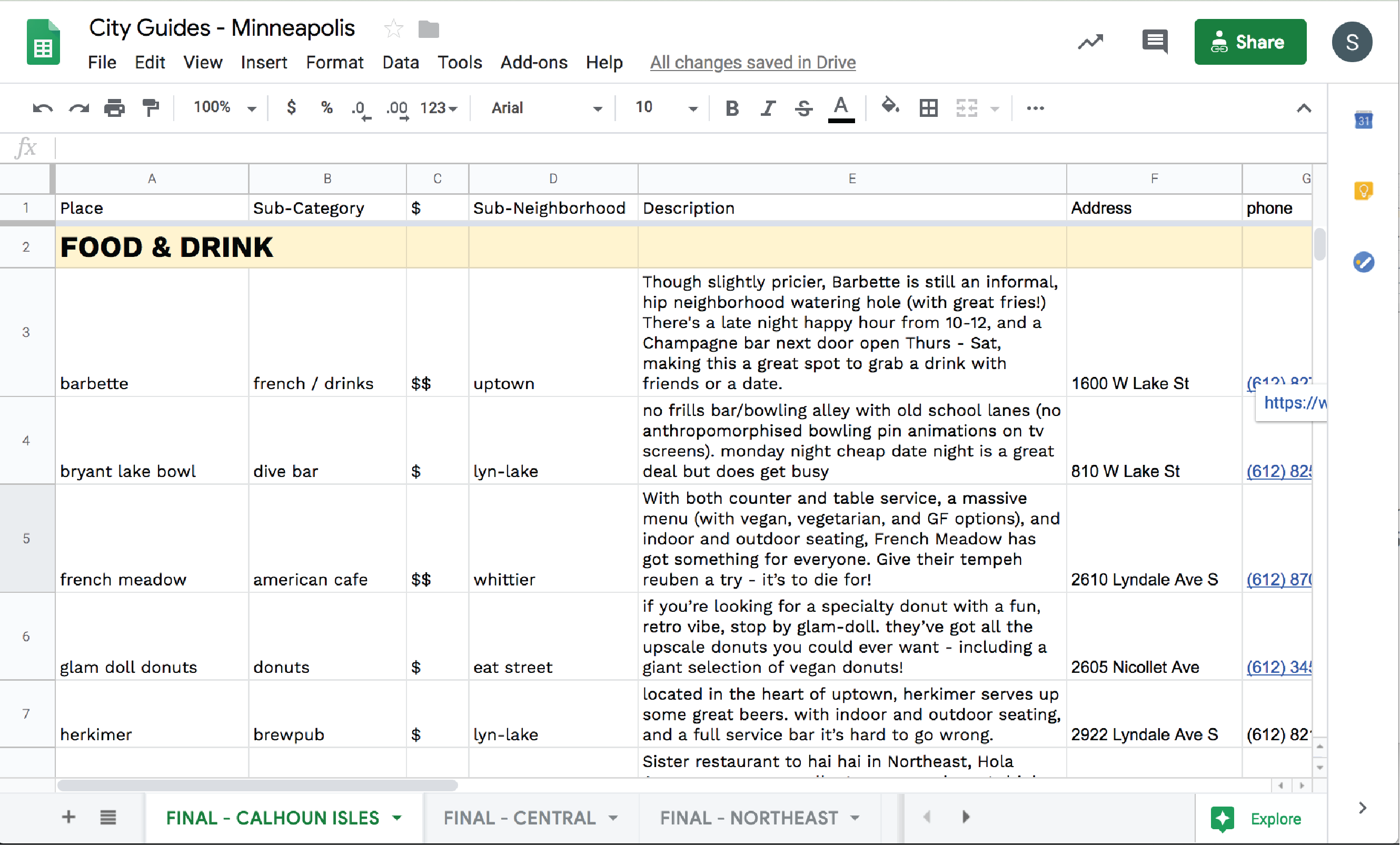
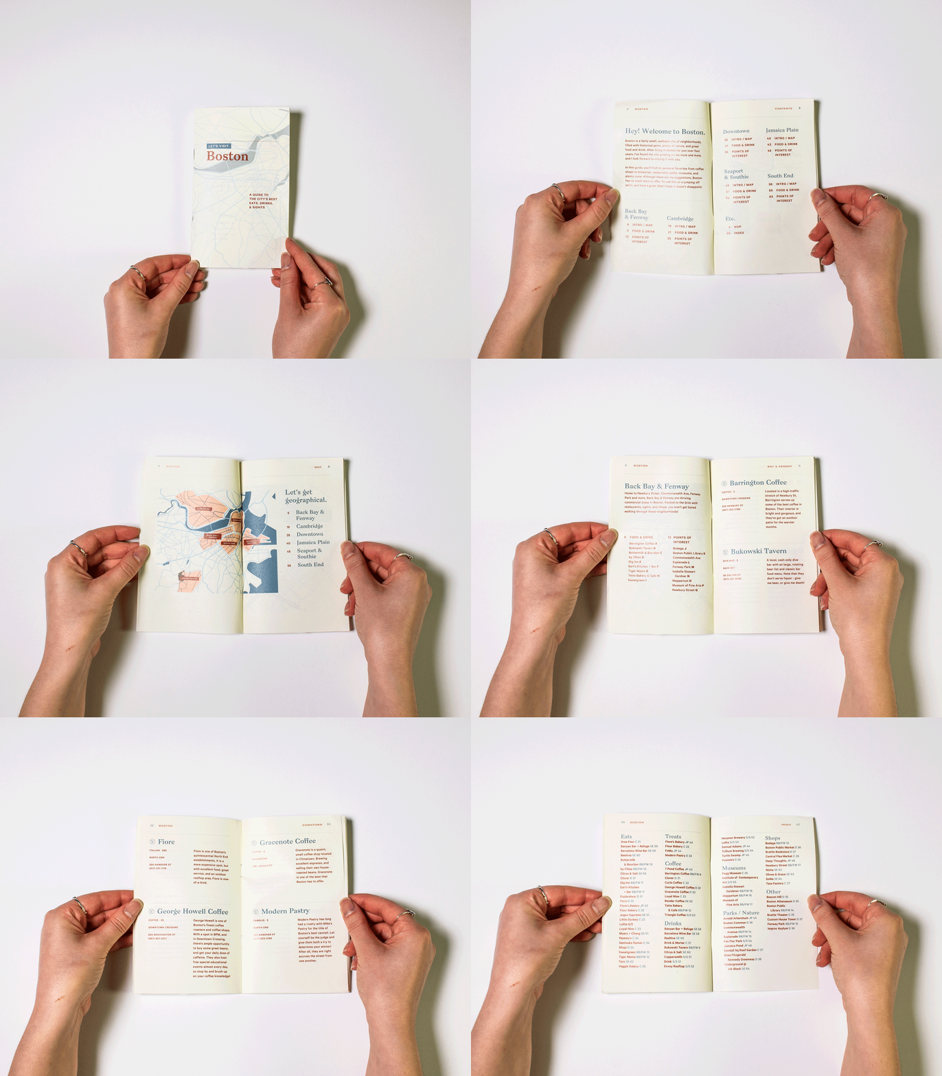
For years now, friends and family have asked me for recommendations for restaurants, things to do, coffee shops, bars, and more. After sharing a half-baked google spreadsheet with them for years, I decided it was time to use my design skills and turn those spreadsheets into something tangible. In comes Let's Visit - a series of city guides designed to give you a local's view of a city, the kind of input you'd get when asking a friend who lives in the area "I'm in town for the weekend, what should I do?"
Over the course of a few months, I dug deep into my brain, reached out to friends, and scoured the internet for my best recommendations for the two cities I've lived in the longest in my life: Minneapolis, Minnesota and Boston, Massachusetts.
PROJECT GOALS
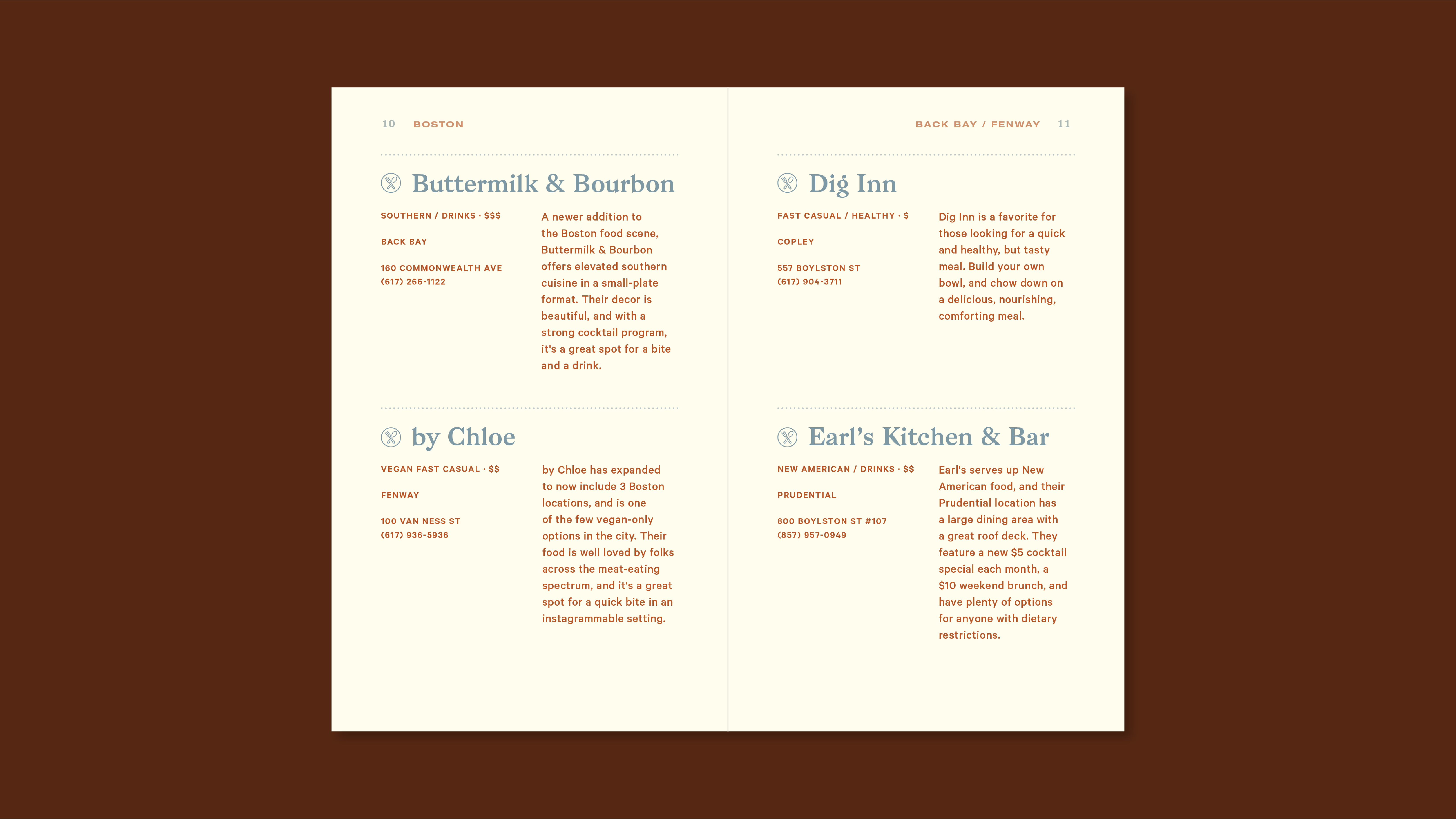
I wanted to make sure the guides were not only visually appealing, but also practical. By utilizing maps, indexes, neighborhood "sectors," icons, and typographic hierarchy, I was able to convey all the information necessary in a concise, and easy-to-read format.
I worked closely with my faculty mentor, Doug Scott, on this project, who guided me through the process, helped me to create a timeline, organize my ever-expanding spreadsheets, and come up with a system that would allow me to build upon these two protoypes and use this format for an unlimited amount of cities.
ABOUT THE PROCESS
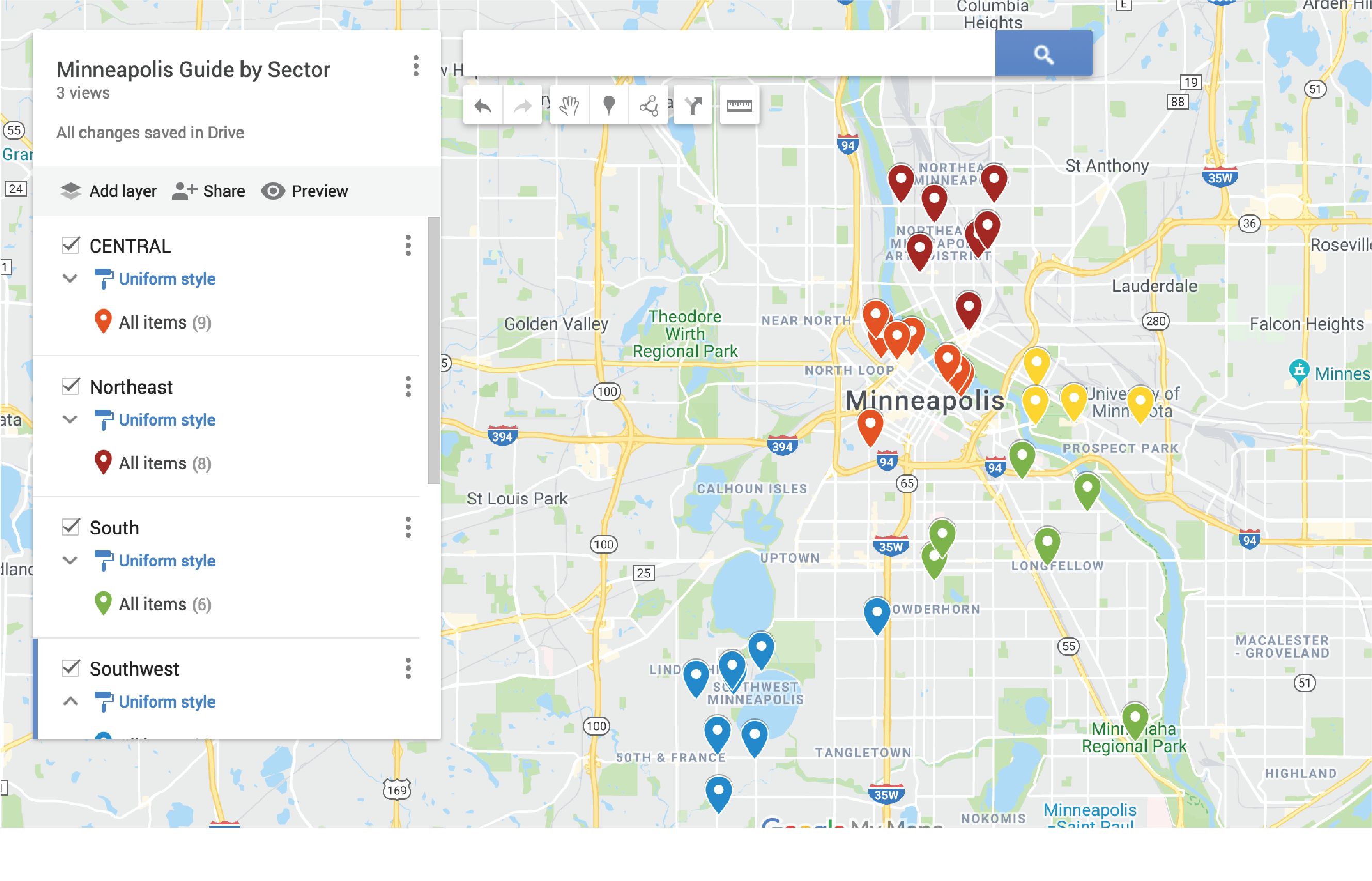
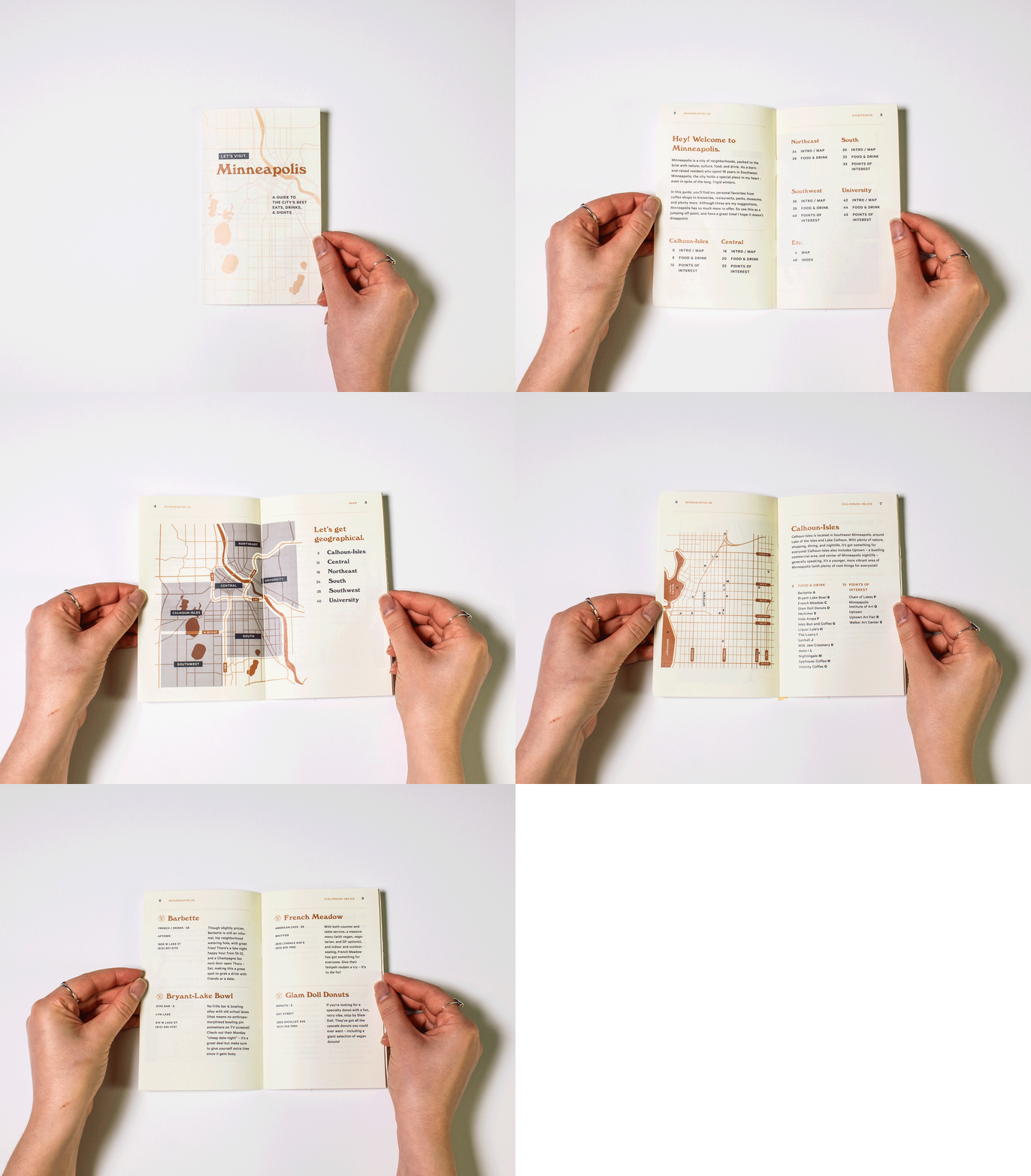
I began with the Minneapolis guide, and spent some time determining all of the places I wanted to include, what size the booklet should be, what colors, typography, hierarchy, and layout to use. Next, I determined the boundary lines for each of the "sectors" within the city, sorted all of the places, and started to create maps, write descriptions, and collect basic information that would be included. Once the basic structure was in place, it was just a matter of creating the content, and fine tuning things until everything was in good shape.
After the Minneapolis guide was complete, it was time to implement the same process with Boston, but with slight shifts in color palette and typography. Boston presented some new challenges due to the odd layout of the city and neighborhoods, so I had to troubleshoot and reformat certain elements to better suit the layout of the city.
FINER DETAILS
To make the guides as functional as possible, each guide includes:
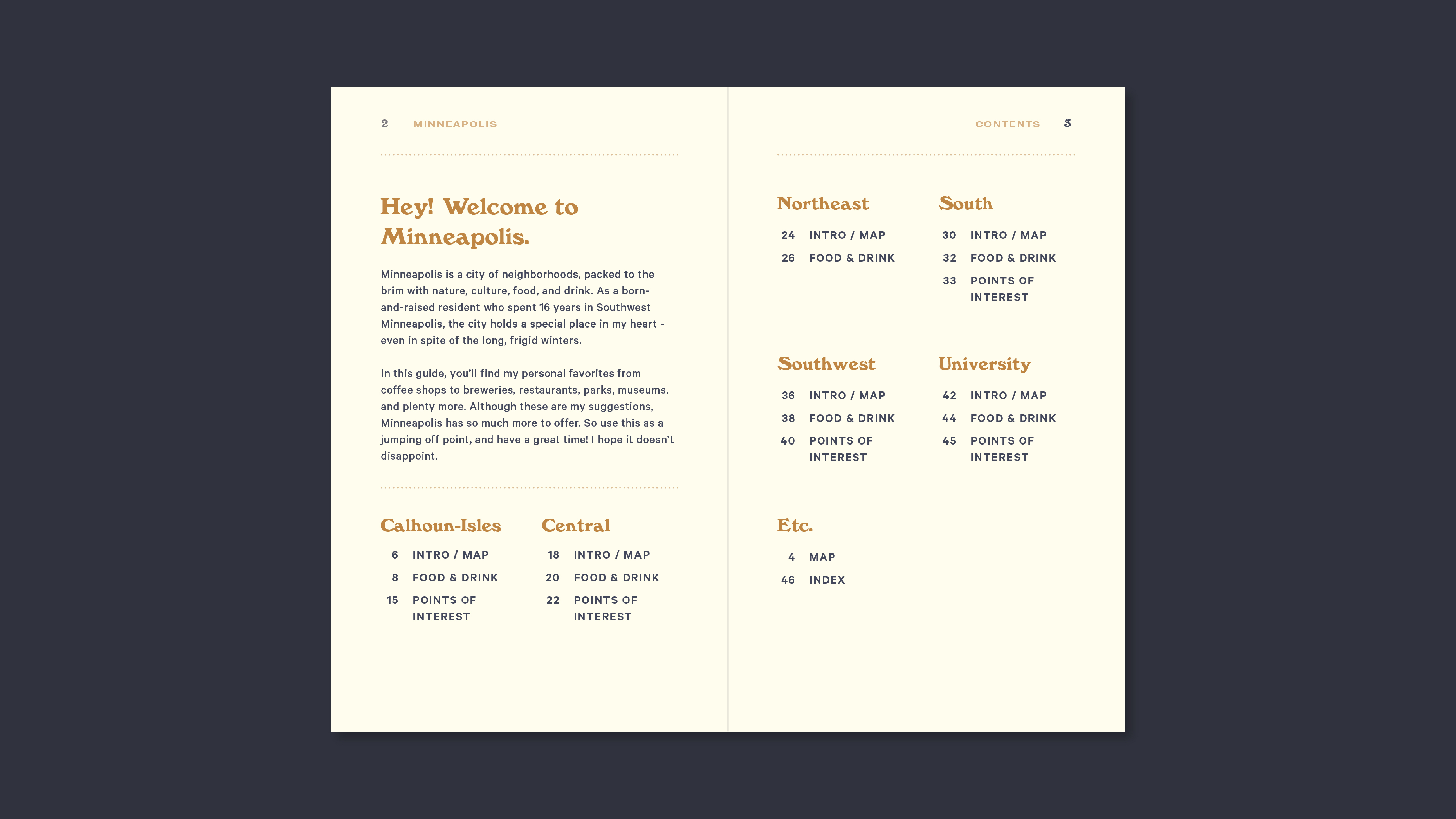
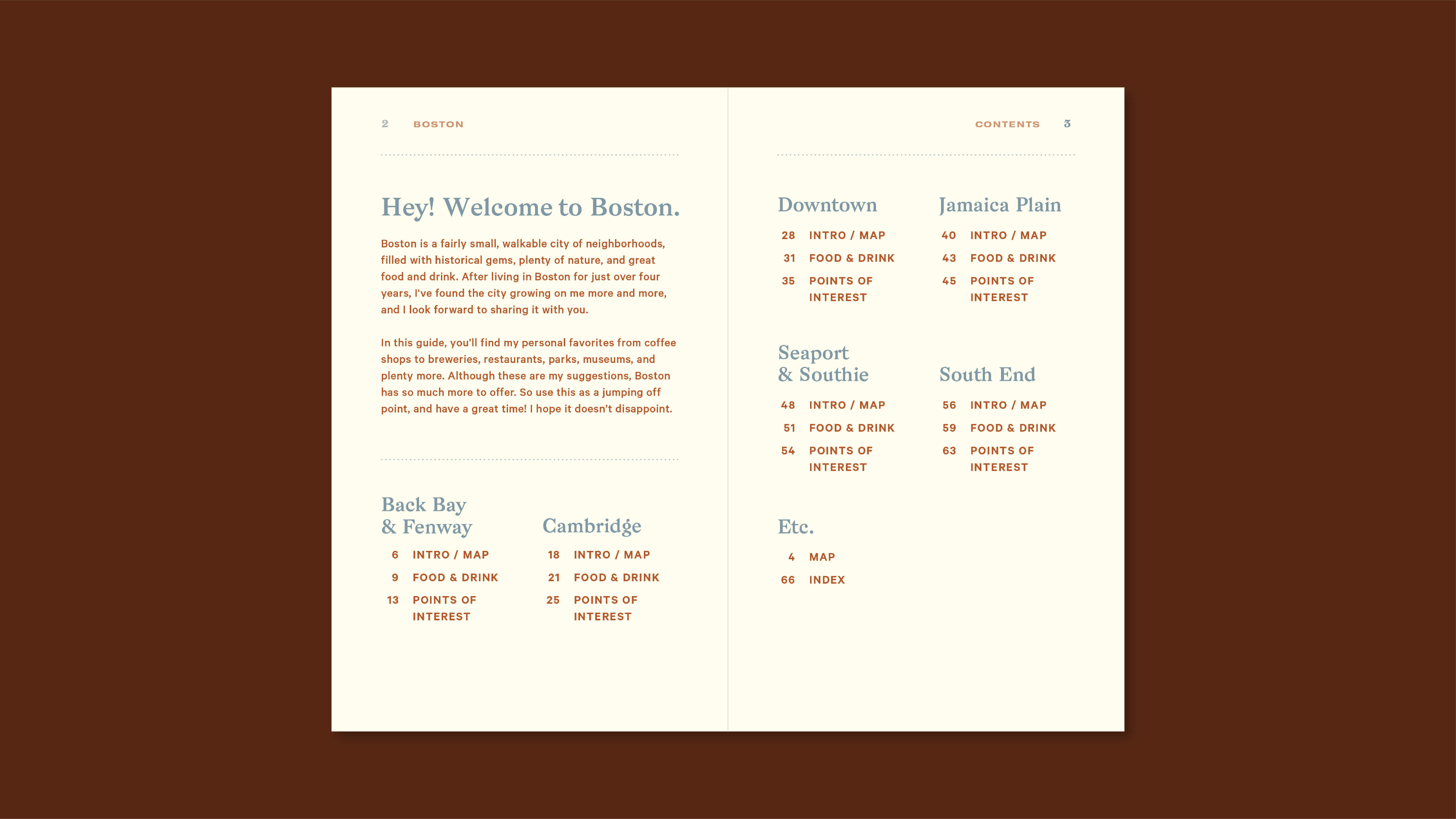
Introduction to the city and table of contents
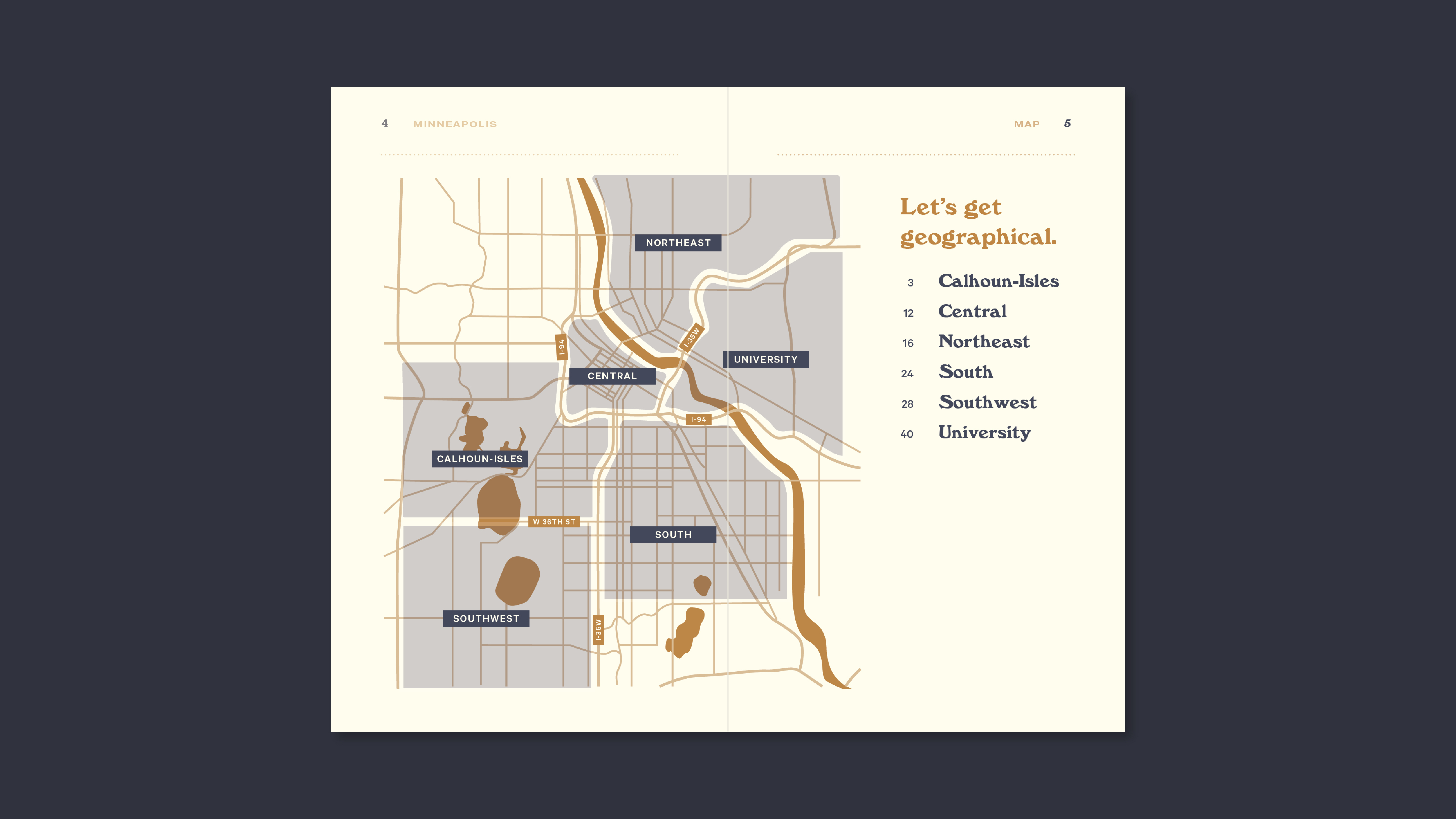
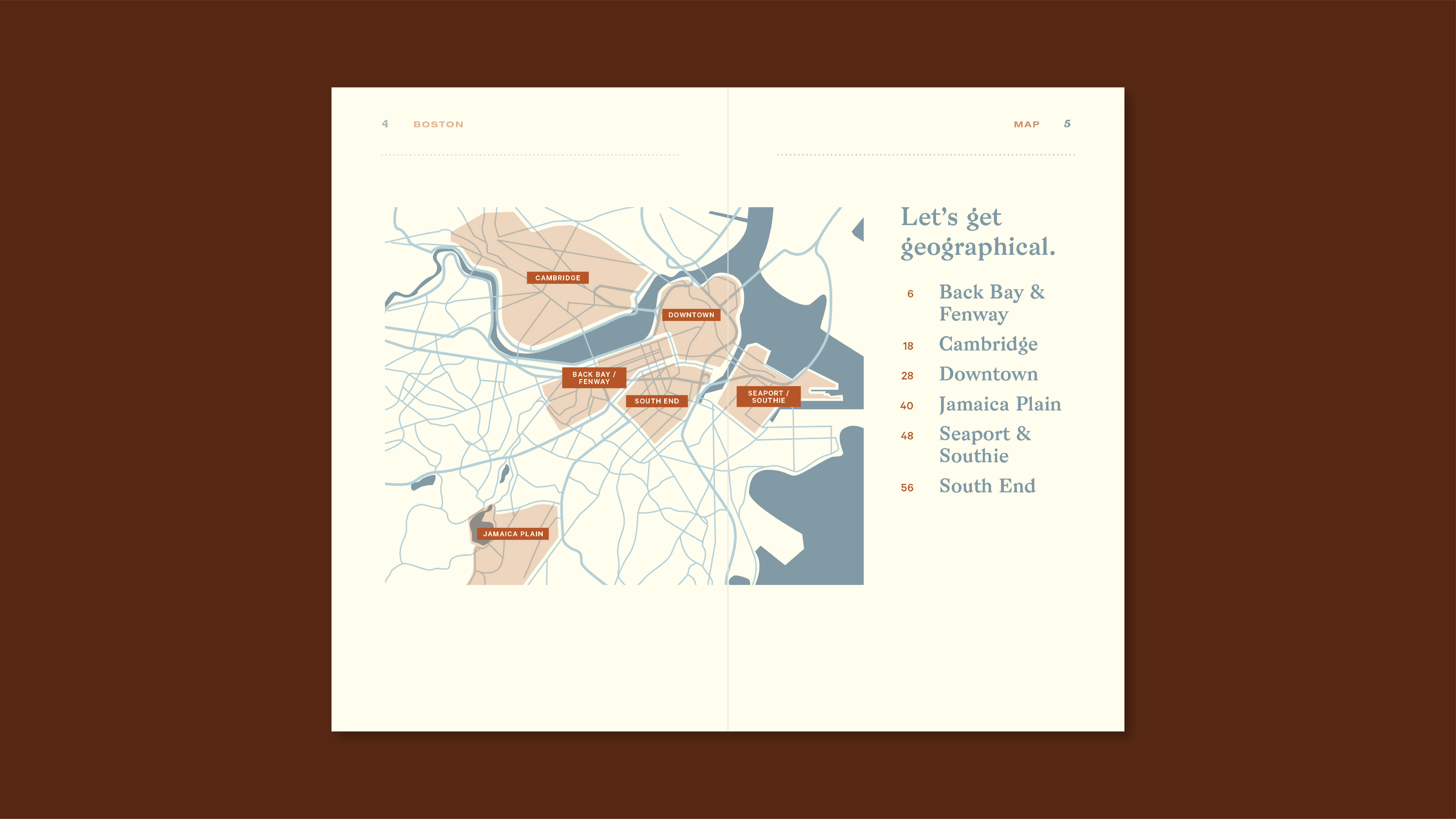
Main map displaying the whole city and each sector
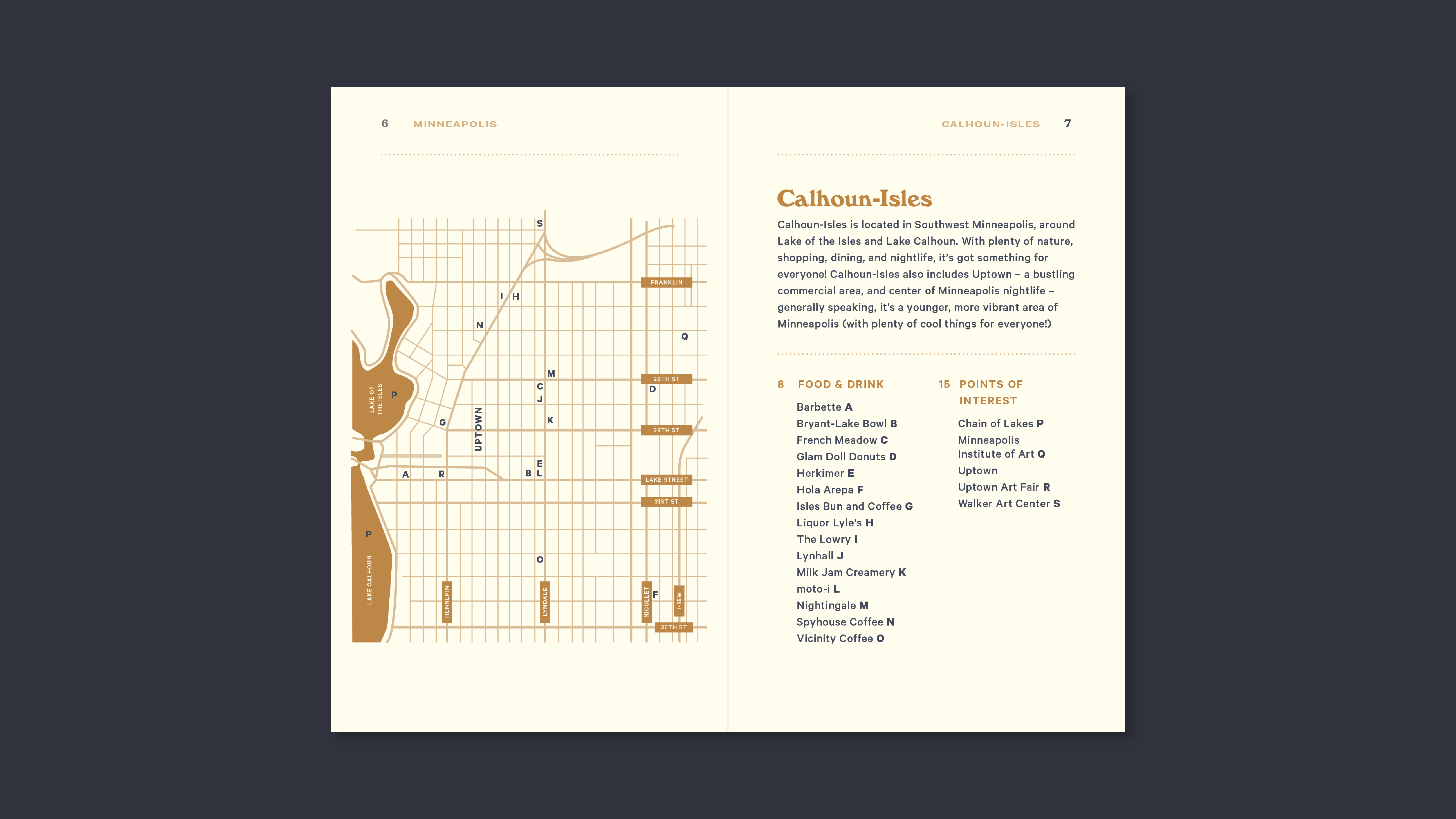
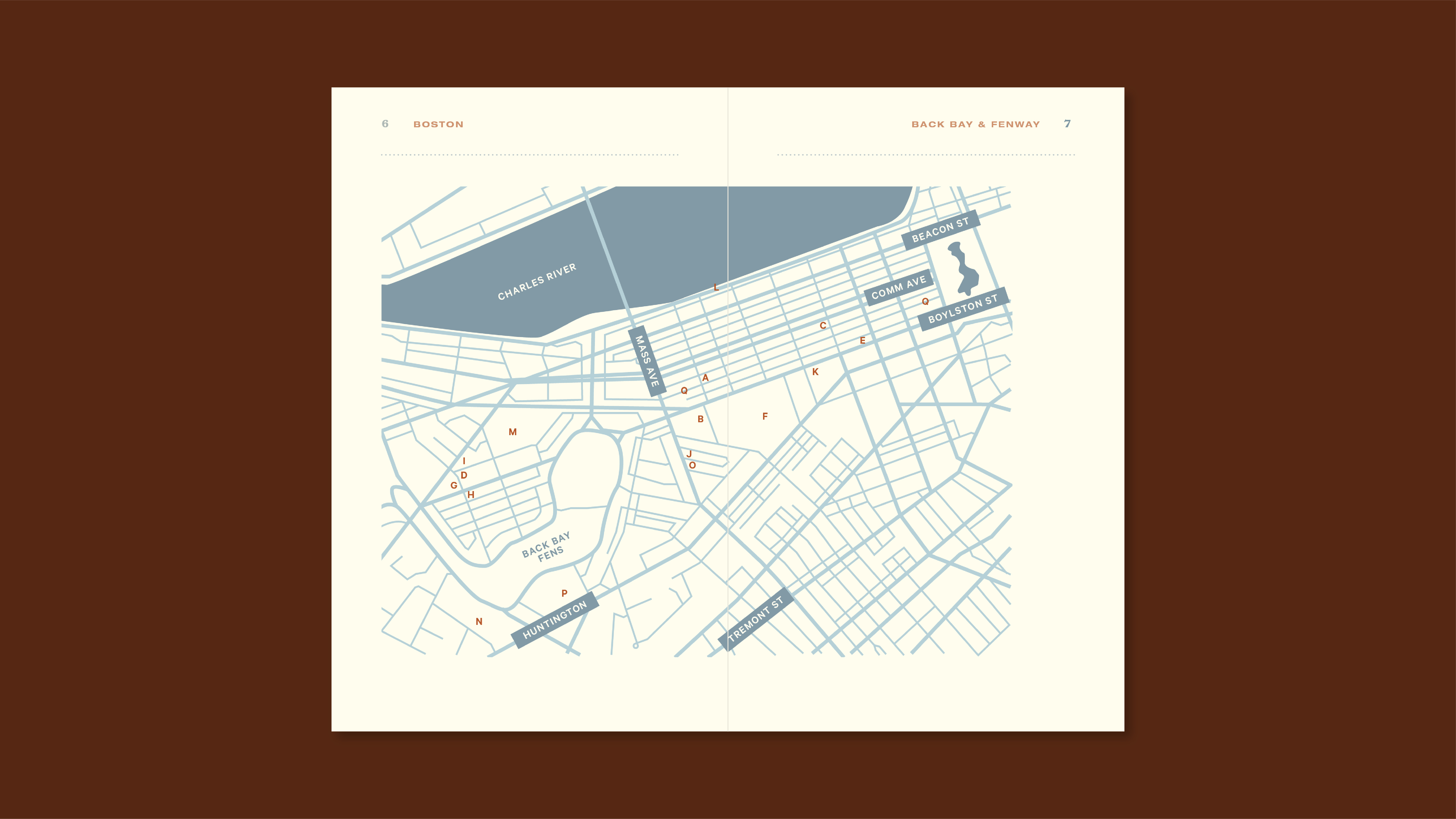
Individual sector maps and table of contents
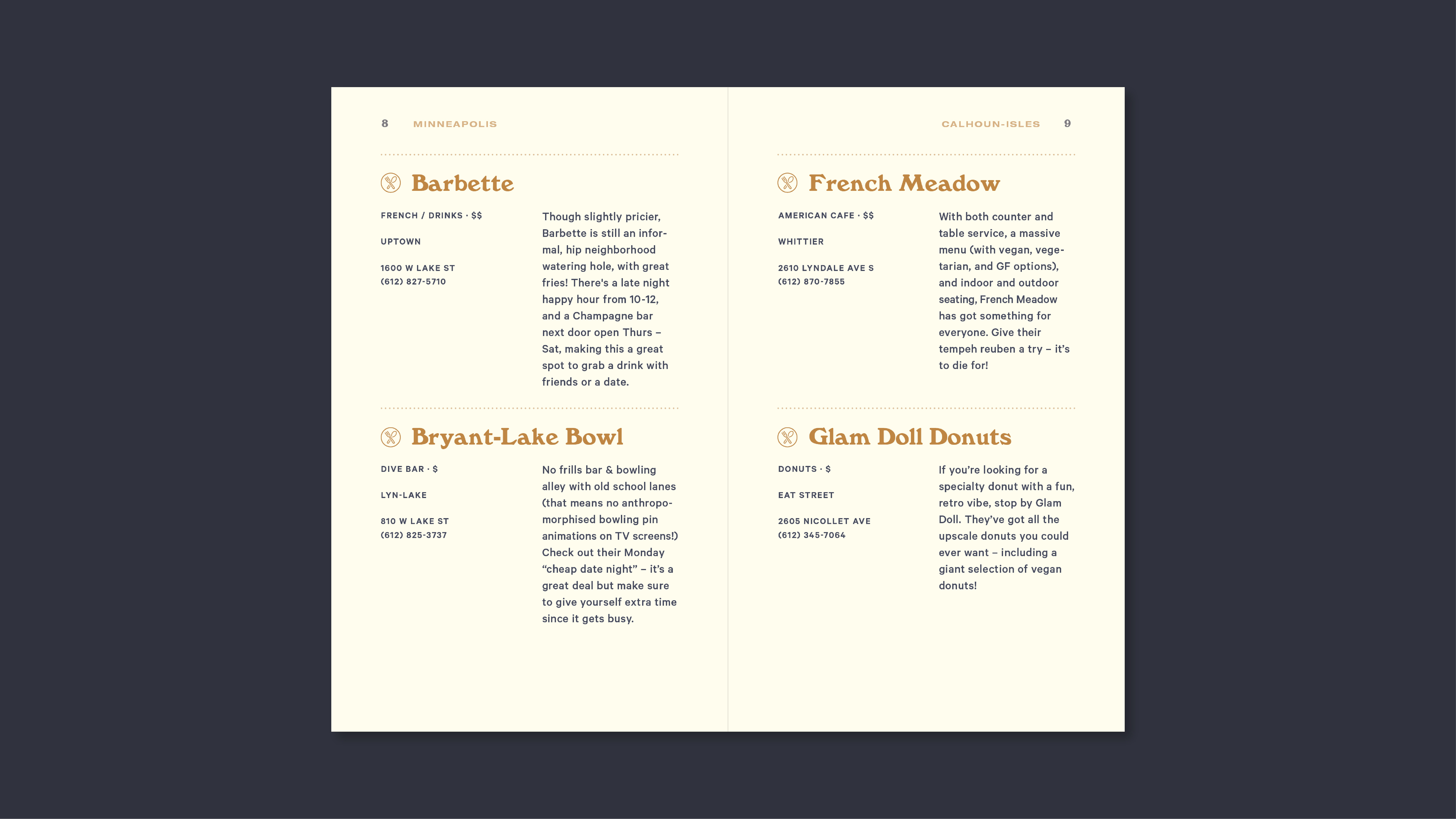
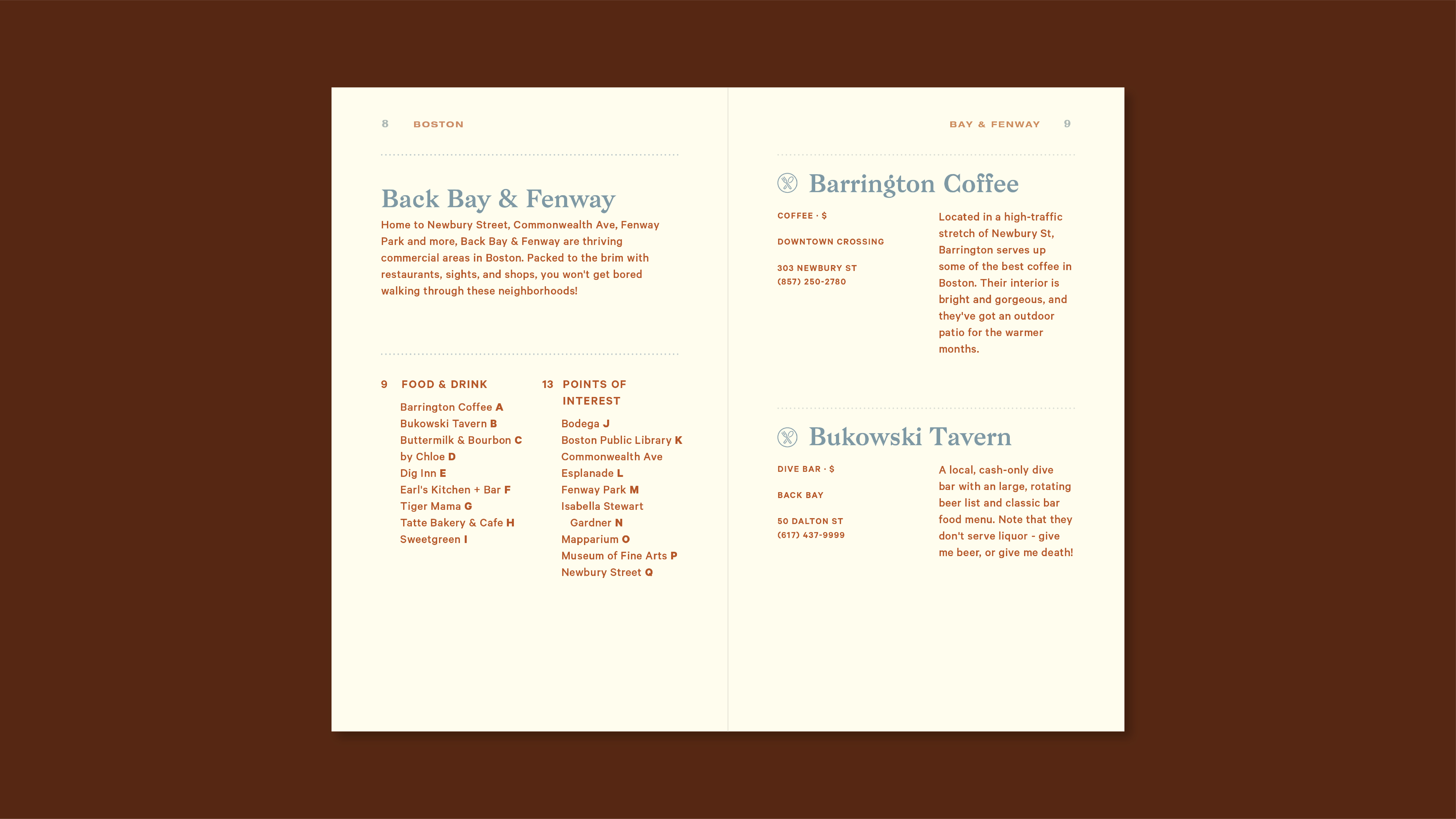
Detail pages with place, category, price range, neighborhood, address, and phone number
Icons distinguishing food/drink & points of interest
Rear index - sorted by category
